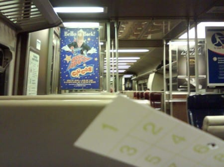
Every single day we go through, we are bombarded by advertisements. On the television, billboards, and even on our commutes. All Metro-North stations and trains have plenty of advertisements themselves. And on some of the newer trains, they are even testing video boards for advertisements. I have yet to see one of those. But before you know it, I’m sure all the trains will have them. The MTA needs the money.
But I think compared to a lot of other advertisements, Metro-North train ads end up getting looked at a lot longer than most other advertisements. Which, if you are an advertiser, might be a good thing. Take a billboard, for example. You drive by it, or walk by it, and there is only a small finite amount of time where you are actually looking at it. On a Metro-North train, it is impossible to not see an ad. You are essentially sitting in a tin can for an allotted period of time, probably around a half hour, possibly more. You are looking forward, and the ads are just there. Subway ads are sort of there, but you really can go through an entire ride ignoring those, as they are smaller, thinner, and higher up. If an ad is good, there is a good chance a possible consumer is going to look at it, and for a long time. Longer than the few split seconds that some ads get. I’m sitting here for a half an hour. I need something to do.

Just by facing forward, you are going to see a bunch of ads. It is inevitable. You will see them.
Most days I ride the same train, in the morning or the evening. And I sit in the same car both rides. So often times I see many of these ads quite frequently. There are some that I like, and some that I hate. But some of my favorites are the ones that take into account the location and audience of the sign. Whoever designed them understood that they can possibly be looked at for longer periods of time. Because like I said, sometimes I need something to do.
My current favorite ads that are in rotation on Metro-North trains are some ads for Marks Paneth & Shron. I’m not a big city businessman, so I am hardly the target audience, but the concept was intriguing. Each poster has a puzzle. That puzzle gives me something interesting to do while I commute to work. I get the idea of the ad at first glance, yes. But there is the added intrigue of completing a puzzle, if I happen to look at the poster longer than that initial split second.


Two of the Marks Paneth & Shron ads
Another favorite poster of mine were advertising a book, by Dean Koontz I believe. Unfortunately I don’t have a photo of it. The ad had a photo of a book, and a phone number that you could text with your cell phone. When you texted the number, it would periodically send you story excerpts of the story to read on your phone. Personally, I think this is an awesome idea. It advertises your product, it gives people something to do on the train, and it transcends this sort of boundary between the physical world, and the virtual. Japan is a bit more advanced in connecting their ads to online information and websites. Many ads there have QR codes, which is a type of barcode, but it can hold much more data than the UPC codes we are used to on our products. Use your camera phone and take a picture of the code in the ad, and you are automatically forwarded to the ad’s website in your phone’s web browser. Maybe we’ll see that here at some point in the future.

Example of what is called a “design qr code” that I made. If you had a QR reader on your phone, like Japanese cell phones do, you would be forwarded to MTA’s new website (mta.info)
Anyone else have ads that they really enjoy? Other than the Sweet Million ads? (I know a lot of people find my blog searching for pictures of those ads online. They are pretty damn cute. Yay, kitties and puppies!)

