Today as a graphic designer, I have various different methods for catching your attention in an advertisement. Attractive imagery, and most importantly, color, are major ways a designer can catch your eye. But what if we’re talking about design well over a hundred years ago, when color printing and photography wasn’t around? Although using various typefaces is certainly an option, my personal favorite tactic of yesteryear is the pointing finger. You know things are serious when that finger comes out!
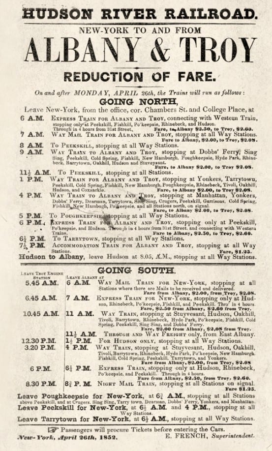
The Hudson River Railroad schedule above, printed in 1852, makes use of the pointer finger in a very small way – it is visible at the very bottom. But what if you really wanted to get people’s attention? You can’t make it red, so clearly it needs to be BIGGER!

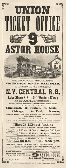
Bigger. Like this. You will never forget the number 9!
That is a HUGE pointer finger! Guess you better remember to buy your train tickets at the Union Ticket Office, at the 9 Astor House! Note that this 1861 ad makes additional use of the finger in a smaller way – highlighting the fact that they sell tickets to all railroads, not just the Hudson River Railroad or the New York Central.
Next advertisement I design, I think I am going to stick a big pointer finger in it. We’ll see how well that goes over…


Love these, they’re as much fun as old maps.
☛ Google “manicule” for more than most people will ever want to know about the pointing finger. ☚
☛ Great stuff. ☚